Café de’ Mercanti
A little Montréal.
A lot of atmosphere.
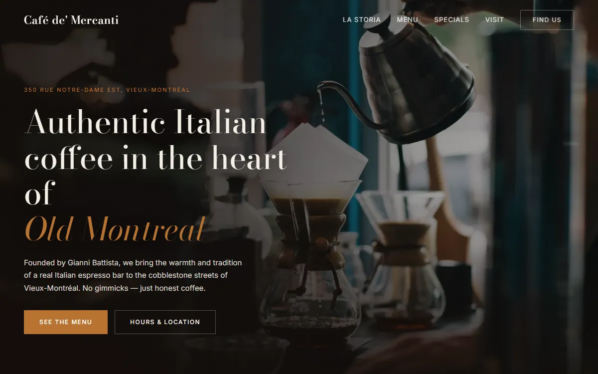
An unofficial website concept for an Old Montréal espresso bar. A study in typography, rhythm, and the feeling of a place.
- Hand-built in HTML, CSS & JS
- UI/UX concept
The direction
An Italian espresso bar deserves more than a generic restaurant template. The design pairs Bodoni Moda headings with Inter body text and a palette of espresso, crema, parchment, and copper. This is a personal concept, not the café’s official website.
Details that do a job
A full-bleed hero introduces the location and clear next steps. The menu supports tabs, dots, and touch swipes. Auto-advance pauses on hover. Opening hours highlight the current day alongside a map, while the mobile navigation keeps the page easy to move through.
Built without the overhead
The interface is hand-built in HTML, CSS, and JavaScript. Image cards, a gallery, and restrained movement provide atmosphere without needing a frontend framework. The interaction design stays in service of finding the menu, hours, and location.
What I’d do differently
Plan contrast from the first mockup. White text that worked over one photo became unreadable over a busier image, so the overlay now darkens the text’s side of the hero. Images are stored with the site rather than depending on fragile hotlinks.
Care about what people see.
Care just as much about what they don’t.